We have put a lot of effort so that DINAMIS’ reports are concise, comprehensible and above all practical, aiming to become the only point of information that you and your salespeople will need.
1. Sales report
1.1 Basic sheet
The basic sheet is deliberately a single page and contains year to date quotas and sales figures, in actuals and in credits, for all targeted products & activities, as well as a performance indicator for each product, group of products and overall.
Let’s have a closer look at its structure:
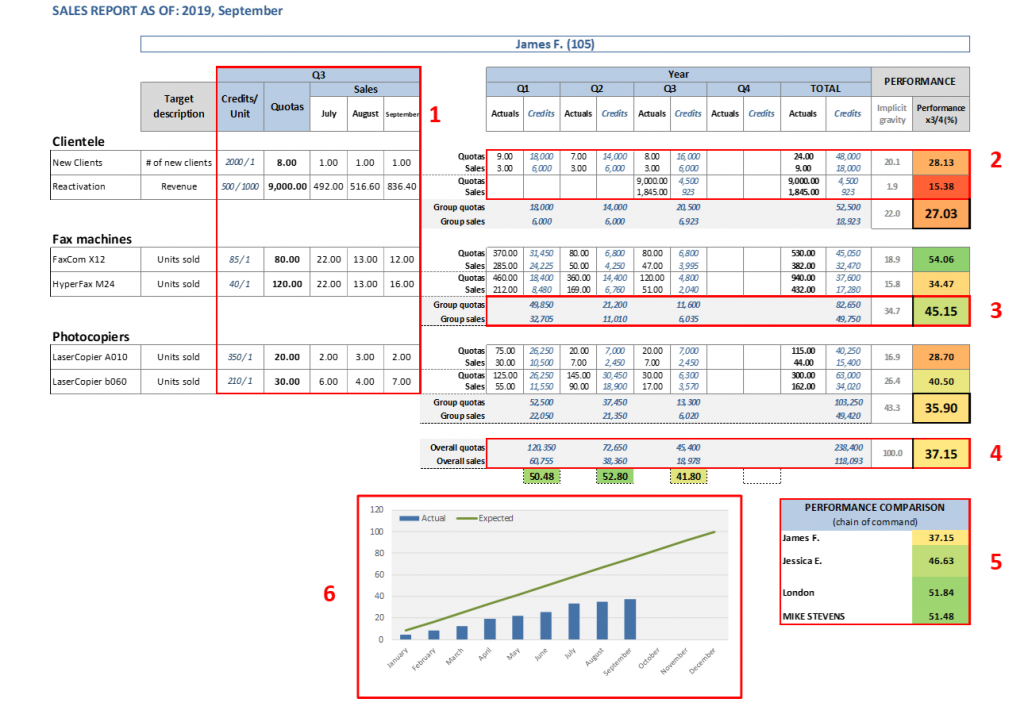
- Current quarter product data: Displays quotas and monthly sales figures for all targeted products & activities, for the current quarter
- YTD product data: Displays quotas and sales figures for all targeted products & activities, for each quarter and for the entire year. It also displays product gravity and performance.
- YTD group product data: Same as above but aggregated on a product group level. The only difference is that only credits are displayed since you cannot add actual figures on products of different nature (e.g. units and revenue). Product group data appear in the sales report only if you have chosen so in the Report Structure tab (default is true).
- YTD overall data: Same as above but for the entire range of targeted products and activities.
- Performance comparison: Displays the Overall Performance Indicator (OPI) for all higher levels of hierarchy where the sales node belongs to.
- Performance diagram: Displays the monthly OPI progression vs the expected one, the latter based only based on the month.
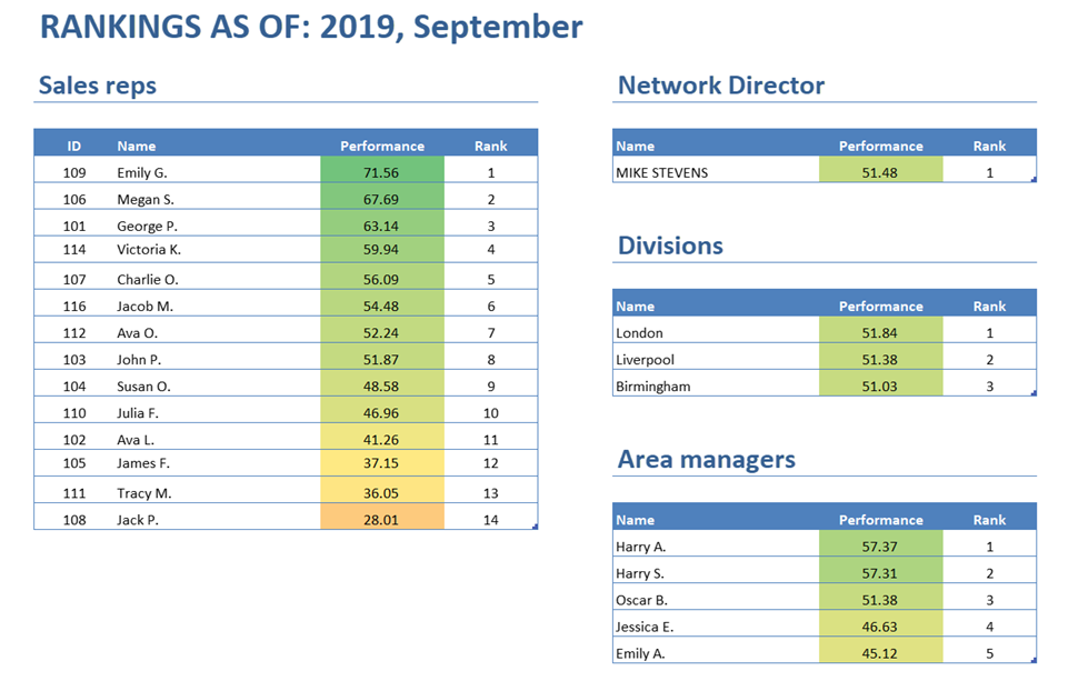
1.2 Rankings
The Rankings sheet, as its name reveals, displays the rankings per hierarchy level. It appears in the sales report only if you have chosen so in the Report Structure tab (default is true). Note that it will appear exactly the same in all the sales reports, regardless of the node level. For e.g. the sales reps can also see the rankings of the Area Managers they report to, and so on.
In our example we have a four-level network (Network Director → Divisions → Area Managers → Sales Reps):
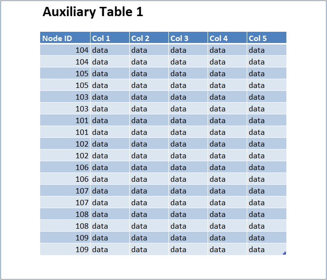
1.3 Auxiliary tables
It is not uncommon that when you send results to your salespeople, you also want to provide them with some data, especially if you don’t have a CRM infrastructure.
DINAMIS provides you with the very simple solution to embed this data into the sales report. In this beta version, it allows you to add two tables that will appear as two distinct sheets in the sales report. The tables are filtered so that each sales report contains only the records that relate to the sales node(s) it addresses to.
The auxiliary sheets will look something like this:
2. Management Dashboard report
The Management Dashboard is a hands-on, single page report, that gives you valuable insight on how your sales network has performed. Let’s have a closer look at its structure:
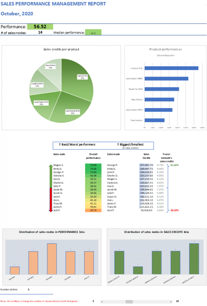
- Sales credits per product: Where does your revenue come from? This pie chart displays all products and their share in the overall sales credits.
- Product performances: A bar chart that sorts all products based on their performance
- Best/worst & biggest/smallest performers: The first of these two tables displays the top and bottom ten sales nodes, based on their OPI. However, a big performance may correspond to a small revenue or vice versa, so the second table displays the ten biggest and smallest sales nodes, based on their sales credits.
- Distribution of sales nodes in performance bins: If you have a large sales network, you sometimes wonder whether its satisfactory performance comes from a few overperforming sales nodes while the rest of your network is underperforming. In other words, you need an OPI histogram that groups the sales nodes into OPI ranges (they are called bins). You can dynamically change the number of bins between two and ten from the underneath scrollbar.
- Distribution of sales nodes in sales credits bins: This is the complementary histogram. It is one thing if the OPIs are normally distributed but a completely different one, if your revenue (sales credits) is also normally distributed or it comes from a few sales nodes, regardless if they overperform or not. Compare this sales credits histogram with the OPI histogram and draw useful conclusions. You can use the same scrollbar as before to change the number of sales credits bins.
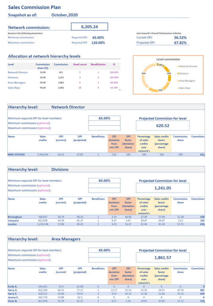
3. Sales Commission Plan report
The Sales Commission Plan report concentrates the structure and a full set of results of the SCP.
In displays in order:
- The network commission and the parameters it is based upon
- A table and a diagram with the allocation of the network commission to all hierarchy levels
- For every hierarchy level:
- The level commission and the parameters it is based upon
- An analytical table with the allocation of the commission level to all its members